Saturday, May 14, 2011

Website Project - Final Revised


I decided to take some of the ideas that I got in class during the presentation about making the "Top 10" section wider and adding an embedded player on my site. I find it came out really well and it does fill in the website much better than the previous layout. 

Tuesday, May 10, 2011

Website Project Step 4 - Final


This is the final portion of my website. I had made two different backgrounds (from photoshop tutorials that I found online). I preferred the starry background because it popped out more and was nicely represented. I tried to keep it as simple as possible but I also wanted enough detail to make the website different and stand out. Majority of the wording on the page would be links that would access other pages in the website. Though this is the main page that would give people quick access to certain areas of the site, search for something, and see what's new without having to go any further. 


Website Project Step 3 - Design


Here is the design I decided to try for my website. I took some ideas from other sites and kind of mashed them together. 

Thursday, May 5, 2011

Website Project Step 2 - Description

I have decided to design a website for aspiring DJs and music lovers.

Content:


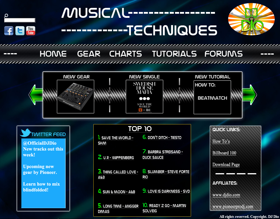
The website will be a resource for anyone who enjoys music and the technical/electronics that are used to help create music. It will also offer tutorials on how to become a DJ and how to produce. It will be a one stop place for people to see the latest songs in a specific genre of music as well as the newest gear that they can pick up or that is soon to be released. The site will also include a forum and all kinds of information/FAQs.

Look:


I would like the website to be different yet simple, with a modern/industrial type of design to it (the idea may change as I progress into the project). I would like it to include my DJ logo because it would be a website of a DJ (myself) giving info to others (something like "DJ Dio's Corner"). The logo would be situated at the top right and a solid bar that runs below it, indicating the different sections of the site (when the mouse rolls over a tab, it will be highlighted as well). The rest will be shown in the sketch that I will post up next.

Website Project Step 1

There are many websites out there. Some that have different concept designs and some that are really plain and simple. Here are the six that I find are the most inspiring:

1- www.apple.com


2- www.avicii.com


7- www.thinkwithportals.com/


Thursday, April 21, 2011

Poster Project Step 4


Here is my final project for the poster. I didn't put as many arrows as my original design because I thought it would have looked too clustered together. I instead added a coloured background with some noise and tiles so that it looks slightly pixelated. I also added a gradient stroke around the arrows and letters of the poster to add some sort of character to it. I still maintained the whole arrow concept at the bottom as well except with two arrows going side to side. Overall I like the way the words fall together how "Illegal" is within one of the arrows going down and the second arrow that is pointing down is used as the "L" in "Downloading" thus incorporating all the aspects of the poster within each other. And staring with the arrow concept I used the universal "Download" symbol as the "O" in "Downloading" and in "Crime" the "M" has an arrow in the middle to shape it out.

Poster Project Step 3

Here are my three thumbnail sketches for my poster design. I wanted something simple and that stands out. I decided to take the first design because it displays the message in bold and also connects to the topic. I have arrows pointing downwards indicating the "Downloading" aspect of it and then an arrow to the side displaying "Crime" to portray the fact that if you do illegal downloading it may send you straight to jail.